The humble trifold remains a powerful marketing tool. Its compact size makes it easy to distribute at trade shows and conferences and leave behind at meetings. But with limited space, how do you ensure your brochure effectively communicates your business message? Whether you use a brochure designer or do it yourself, here’s a breakdown of the essential elements and best practices for crafting a trifold that captivates potential customers.
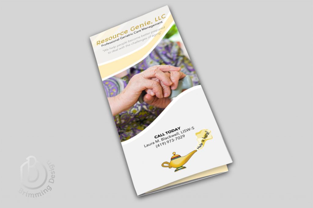
The Cover: A First Impression Powerhouse
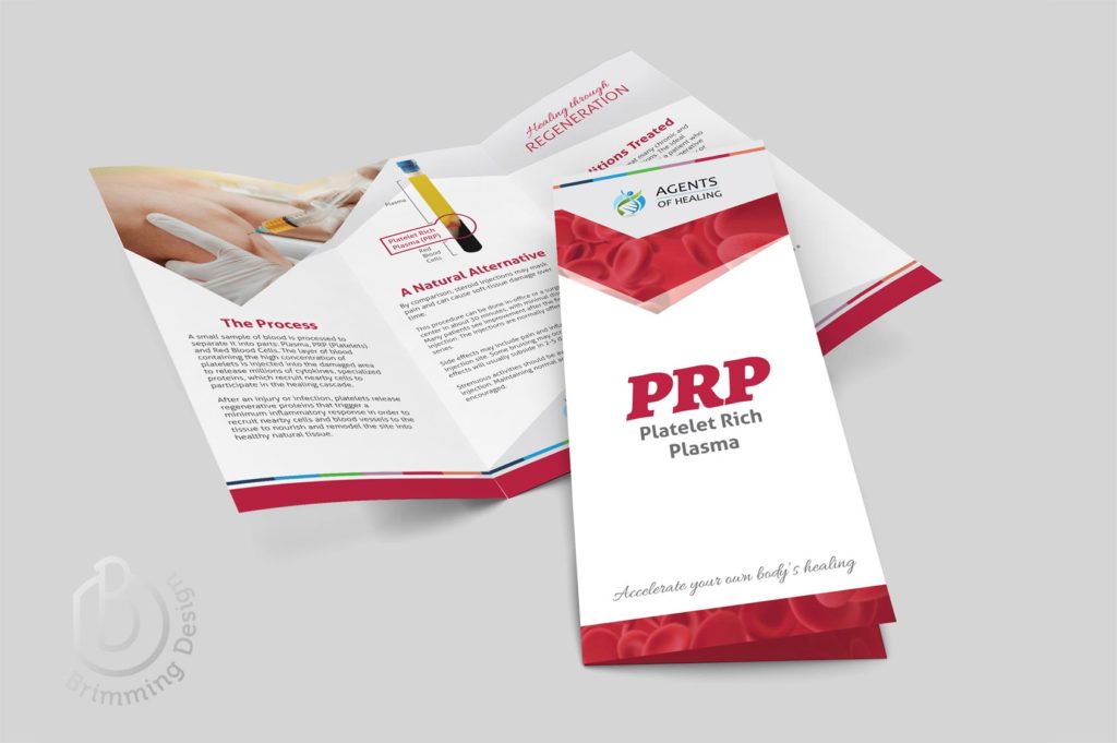
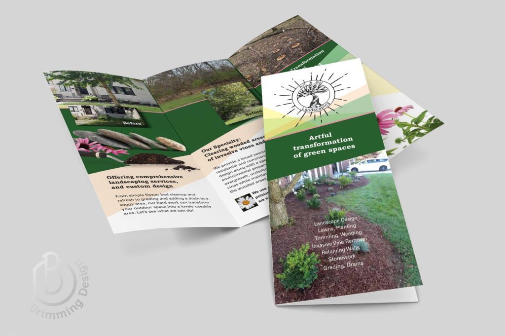
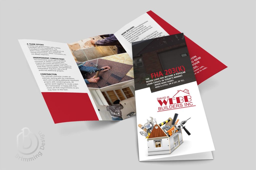
The front panel is your prime real estate. Here’s where you grab attention and entice viewers to open the brochure.
- Headline: Craft a clear and concise headline that speaks directly to your target audience’s needs.
- Visual Appeal: Use a high-quality image that reflects your brand and reinforces your message.
- Logo Placement: Prominently display your logo for instant brand recognition.
Inner Panels: Unveiling Your Story
The interior panels of your brochure design offer space to delve deeper into your offerings. Here’s how to maximize their impact:
- Structure & Flow: Organize the content logically. Consider using a question-and-answer format or a problem-solution structure to guide the reader. Professional brochure design services will aid you in arranging your material for the best communication.
- Compelling Content: Focus on the benefits you offer, not just features. Use bullet points and short paragraphs for easy readability.
- Visual Storytelling: Integrate high-quality photos, charts, or infographics to break up text and enhance understanding.
The Back Panel: The Call to Action
Don’t let your audience walk away wondering what’s next. Use the back panel to:
- Clear Call to Action: Tell viewers what you want them to do – visit your website, call for a quote, or attend an event.
- Contact Information: Include your phone number, email address, and website URL clearly and prominently.
- Social Proof: Consider adding testimonials or logos of satisfied clients to build trust and credibility.
Brochure Designer Tips for Maximum Impact
- Less is More: Avoid information overload. Focus on key points and use concise language. (Too much text is overwhelming and unlikely to be read.) Brochure Designers use white space to give the eye resting places and make the page more appealing.
- Targeted Content: Tailor your message to your specific audience and their pain points.
- High-Quality Design: Use professional design elements with consistent branding for a polished and trustworthy look. As professional brochure designers would do, let the images tell the story.
- Proofread Me: Typos and grammatical errors can leave a negative impression. Ensure your copy is flawless.
Invest in Your Brand with Brochure Design Services
A well-designed brochure is a valuable investment in your brand. Professional designers can help you create a professional and impactful marketing tool that generates leads and drives business growth.
Ready to Captivate Your Audience?
Contact Brimming Design today to learn more about our brochure design services and how we can create a trifold brochure that gets results!
