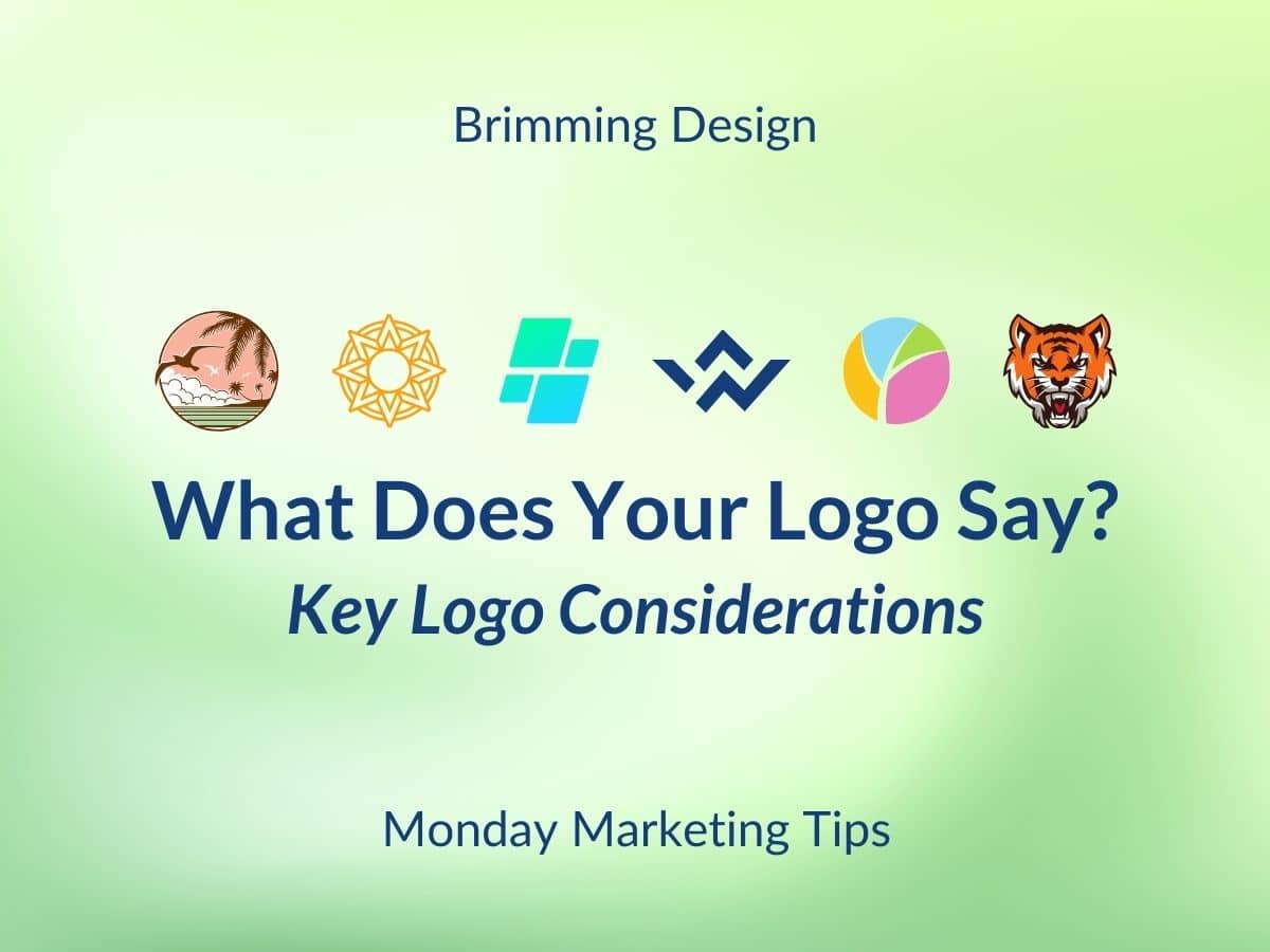
Logos talk a lot, but is your saying the right things? Make sure your logo is making the right first impression to your audience. Here are some top considerations.
- The audience is key. Your image should speak to your audience. You wouldn’t choose a child-like logo in bright colors for a senior home. Nor would an young adult audience connect with and old-fashioned logo. Young professionals will want modern and sleek. Vacationers may prefer bright and playful. Matching the style and colors to your audience not only draws them, but lets them know you understand them.
- Personality Plus. If your company were a person, how would you describe her? Is she fun, edgy, quirky, serious or polite? What colors would she wear? Your logo needs to match her personality.
- Watch the details. Make sure the space between letters (kerning) and lines are pleasing to the eye, and that the sizes of the letters are nicely balanced. For many, this requires asking a professional who can do this in a quick scan. Free logo maker websites may give you an image, but they don’t check the details or ensure legibility.
- Consider the competition. Make sure your logo is unique so that it does stand out as different. If your logo and colors are the similar to your competitor’s, it could cause confusion.
- Consider different uses. Sometimes your logo will need to be read when 1″ tall. Or print on a black surface or in one color. Your logo needs several versions to suit these needs. Professional designers consider these needs and provide the different versions.
- Taglines. Adding your tagline to your logo is fine as long as the logo is large. If you use your logo small, remove the tiny tagline that is no longer legible.
- Convey professionalism. Make sure your logo is used properly in all instances, and that the pieces it prints on also convey your brand style.
There is a reason most people use a professional to create their logos; designing them is not easy! When you have a logo made, ask for guidelines from the designer on various placements, and note the colors, typestyles file formats so you are ready for whatever marketing, merchandising, and promotions are on the road ahead.
A final note from my soapbox: MOST of my clients can’t find an original logo or alternate logo format when I ask for one. Normally I am sent the tiny logo from the website. When you pay to have a logo made, make a point of storing the final art in a logical place where all employees have access when needed. You’ll be glad you did.


