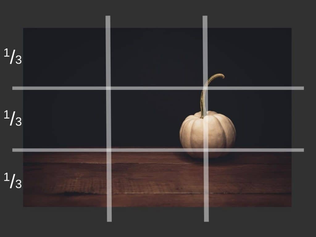
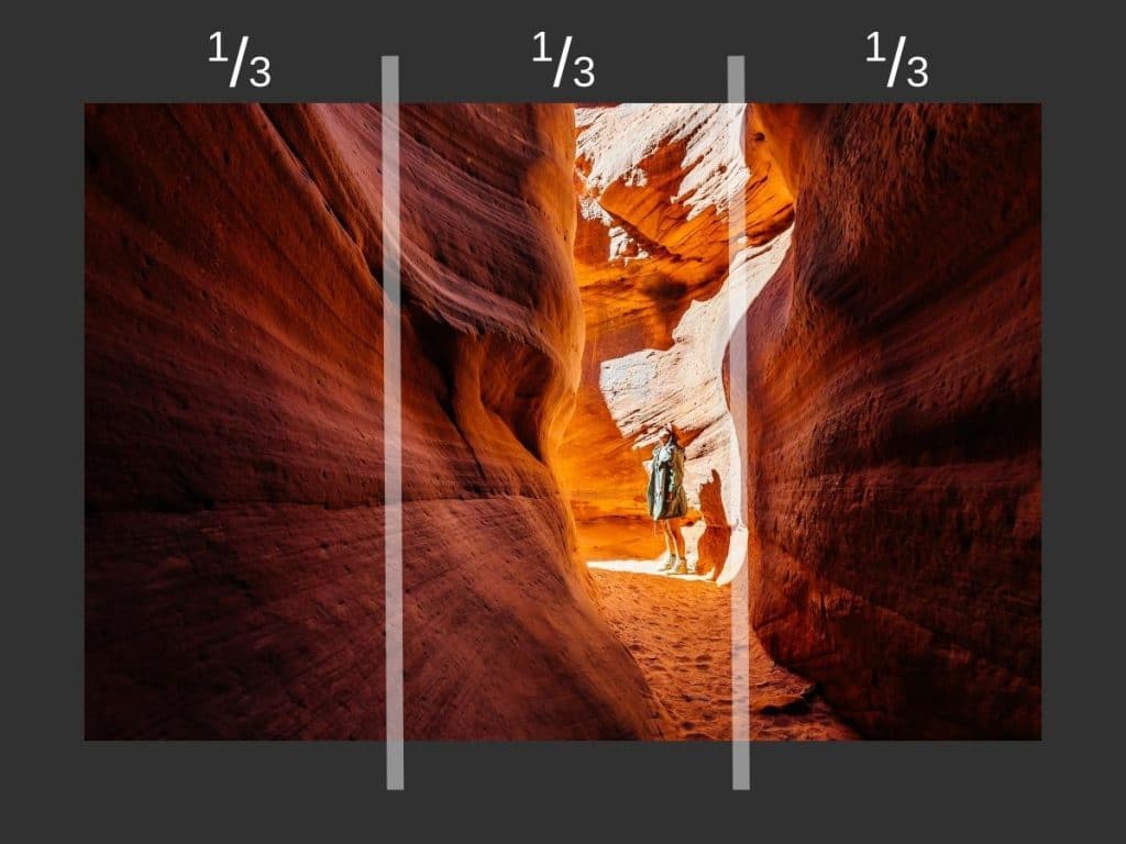
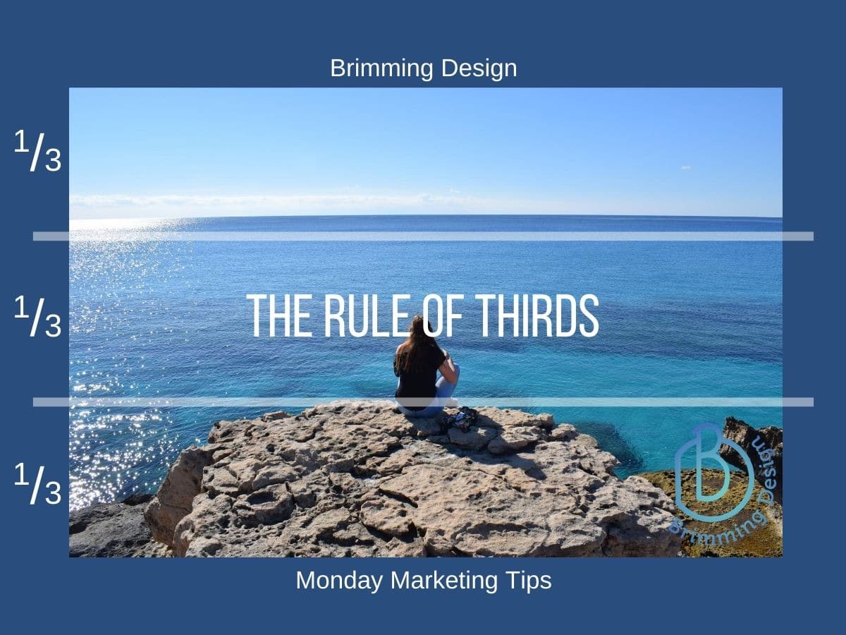
If you are not familiar, the visual rule of thirds is a classic guideline for arranging visual images. From your social media posts, photos, and artwork on your walls, it works! Picture your image divided into thirds both vertically and horizontally. You want to place the primary elements along these lines. This simple rule gives your image more energy and tension to keep your eyes on it. It will make you rethink centering everything.

Rule of Thirds works 3/3 times!
These photographs demonstrate the application of the rule of thirds. The objects of interest, the horizon, subject, etc, are placed along the third lines, creating an interesting composition. The objects don’t have to be exactly on the lines, like with this pumpkin photo. Close is good enough. It provides a pleasing balance and works every time. Try this with your photos and posts!


