Brand Color Theory
Color, which affects mood, helps your potential customer choose your product when making a purchase decision.
You cannot ignore brand color theory because color speaks first, before your image or words. You can’t fight it. As a general rule, you want to use your color as an accent and keep the text dark and readable. Your chosen color should not usually make the entire brand imagery.

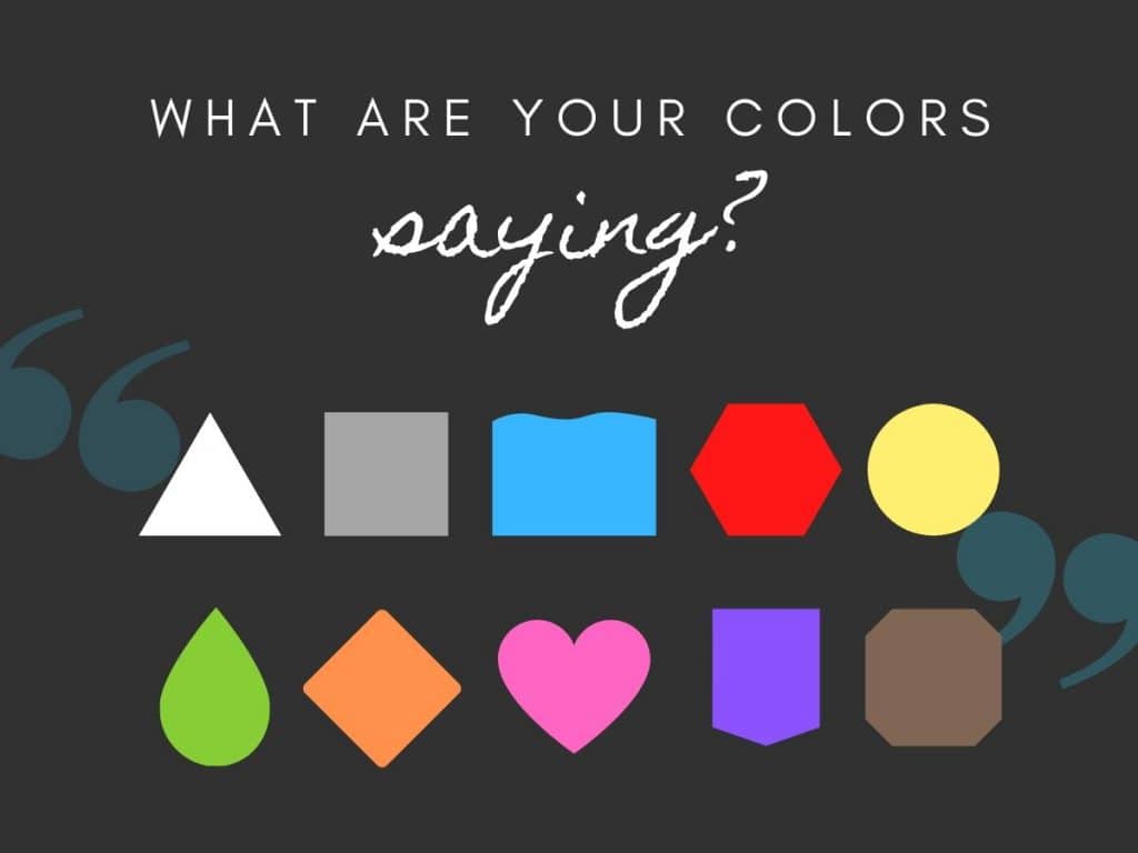
What do colors say?
- Black – professionalism, sophistication, minimalism, power, authority, strength.
- White – humility and cleanliness, simplicity.
- Gray – practical, timeless, neutral, minimalism.
- Blue – trust, security/authority, and dependability. Also sadness and intelligence.
- Red – energy, anger, love, and fire. It works as a call to action or alert and is used for hazardous materials packaging.
- Yellow – happiness, optimism, and positivity.
- Green – growth, money, health, nature, calmness.
- Orange – adventurous, creative, and energetic. Fun.
- Pink – femininity, playfulness, love.
- Purple – luxury, royalty, wisdom, spirituality.
- Brown – stability, reassurance, warmth, earthiness.
Your brand is so important! If you do need to change or enhance your brand’s color, talk to Brimming Design about rebranding and a smooth transition to the new look. We’ll make you look good!
If you want to read about color trends, check out Pantone’s articles about fashion trends, or this article from Canva. Some of this information was gathered from this illustration agency’s article, in case you want to read more.


